A typeface or type family refers to a specific collection of related fonts. Typography design is the art of arranging letters and text and selecting font style, structure, and appearance to present your business message to clients.
“Typography is the use of type to advocate, communicate, celebrate, educate, elaborate, illuminate, and disseminate. Along the way, the words and pages become art.” ~James Felici
The goal is to provide your message in a readable, inviting, and visually pleasing manner that captures your business’s personality and readers’ attention.
When used appropriately, fonts can make your business stand out, help your copy leap off the page, convey your business message effectively, and elicit certain emotions.
What Are Fonts?
Fonts are complete sets of characters in a specific style and size that share a standard width and weight. The characters include letters, numbers, and special characters.
The terms font and typeface are sometimes used interchangeably. However, a typeface technically refers to a group of cohesive graphic forms of characters.
Also known as letterforms, typefaces are related due to repeating specific design elements called glyphs consistently.
A font family comprises a font series. An example of a font family includes the Times New Roman fonts:
- Times New Roman
- Times New Roman Italic
- Times New Roman Bold
Because there are thousands of fonts, it’s helpful to organize them into categories based on the shape of a font’s glyphs. Although certain letters always sound the same whenever they’re pronounced, the glyphs for the letters do not always appear the same in different fonts.

Image Source: Freepik
Fonts may vary significantly in character and design, including:
- Decorative fonts, such as script or handwritten fonts
- Neutral fonts
- Classical or traditional fonts
- Modern fonts
They are used to set a specific style or tone to a business’ print, web, mobile, and screen communications, yet must also be highly readable and legible.
For example, although you may love the look and feel of a particular font style for your business, you may realize that it lacks sufficient readability, particularly in certain mediums, such as on-screen versus print.
Importance of Fonts for Your Business
As a business owner, it’s crucial to recognize that fonts within a graphic design have personalities that give potential clients their first impressions of your organization. They often set the stage for how clients feel about your company even before knowing what you’re selling.
For example:
- Bland, generic fonts that they’ve seen a million times can make clients “move on to the next” without ever bothering to read your message.
- A mix of too many fonts that do not complement one another may result in a hard-to-read mess that distracts from the intended message.
- A font that is truly inappropriate for or seems to contradict the message you’re trying to convey may result in a visceral distaste for your company.
Instead, as you investigate brilliant design resources for workable, creative ideas concerning your own business’ design project, you’ll want to select a consistent company theme that includes appropriate fonts for:
- Business documents
- Print design
- Email messages
- Message menus
- Social media presentations

Image Source: Freepik
Selecting graphic design and fonts that accurately portray your brand’s personality and are consistent with the message you wish to communicate can make your business stand out from the rest and reach new clients.
After all, we often have just one chance to make a positive first impression.
Important Font Selection Tips
Select a font to grab people’s attention and convert their attention into client relationships. Recognize that the font(s) you select can help persuade clients to come onboard or may serve to undermine your credibility and the success of your brand.
Therefore, ensure that your choice aligns with your client’s expectations concerning your brand.
Choose a font that will give your clients a positive user experience and capture your business’s purpose, goals, and overall feel.
Develop a Consistent Theme
When you’re developing your company theme and participating in any design project for your business, understand that different fonts serve different purposes and that you should choose a font that presents the tone you wish to create.
For example, serif and sans-serif fonts were specifically designed to enhance readability to be appropriate for many business types.
Select Complimentary Fonts
Also, when considering appropriate, effective fonts for business documents, note that using two complementary fonts works well.
Online Fonts
For online, including websites and email messages, use:
- A serif font for headlines (e.g., Times New Roman or Century Schoolbook) and
- A sans serif font for body text (e.g., Helvetica or Arial)
You can also use fonts with different weights from the same font family (e.g., Arial and Arial Narrow or Lucida Bright and Lucida Sans). However, you should generally avoid using more than two fonts on one page.
Print Design Fonts
For a print design, you can use:
- Serif for body text (e.g., Garamond or Georgia)
- Sans serif (e.g., Arial or Verdana) for headlines
If you have a niche business with a highly targeted client base, choosing a quirky, whimsical, unconventional (yet readable) font may give a strong impression that grabs future clients’ attention.
Business Fonts: How to Choose the Perfect Font for Your Business?
Consider the following essential points before selecting fonts for your business documents and your web and mobile marketing presence.
Brand Perception
If you don’t already have a well-defined brand personality, consider how you want potential clients to perceive your brand before selecting fonts for business documents.
This step will also be crucial in determining your brand’s voice, logo, and color scheme—all of which should align with and consistently communicate your brand’s personality.
For example, consider the following list, and select 2-5 adjectives that best describe your business:
- Accommodating
- Bold
- Calm
- Casual
- Conservative
- Creative
- Cutting Edge
- Efficient
- Elegant
- Flexible
- Formal
- Friendly
- Informal
- Inviting
- Modern
- Playful
- Polished
- Professional
- Quirky
- Refreshing
- Reliable
- Sincere
- Sleek
- Sophisticated
- Trustworthy
- Unique
- Warm

Image Source: Freepik
The words you use from the list to describe your business should also describe your font choice.
Medium of Choice
Keep in mind the mediums you’ll be using, such as print vs. on-screen, and whether you’ll be sending e-mail messages and regular e-newsletters, developing occasional promos, presenting an art gallery on your website that highlights your products, or otherwise promoting your business.
For example, the majority of museum websites use the Open Sans font family, a clean and modern sans-serif font specifically created to be a readable, legible font on print, web, and mobile interfaces.
Consider Compatibility
In addition, when designing promotional email messages, note that your recipients will only be able to view fonts that are compatible with their email clients, including Gmail, Outlook, and other popular email clients and providers.
Using such web-safe fonts will mean that you can be confident your emails will appear to your current and future clients as you designed them.
There are several web-safe serif and sans-serif fonts, including:
- Times New Roman
- Georgia
- Garamond
- Helvetica
- Arial
- Verdana
- Tahoma
- Geneva
However, remember the importance of selecting the most readable fonts that best match your branding.
Readability
Accordingly, you’ll want to select one readable font for your body text. Preferably, choose a font from an extensive font family with related fonts in different styles. Since they’re connected, they’ll work together visually while providing you with flexibility.
For example, Verdana Pro is a clear, legible, highly readable sans-serif font for print and on-screen. Some other great options are:
- Verdana Pro Light
- Semi Light
- Black
- Cond Light
- Cond Semi Light
- Cond Black
You can elect to use the regular Verdana Pro font for your body copy, the bold for subheadings, and the italic for cutlines, maintaining a consistent look.
Georgia Pro, another large sans-serif font family, also provides a great deal of flexibility. Many note that the Georgia font family evokes maturity, formality, practicality, and stability.
Contrasting Fonts
Image Source: Freepik
Next, you’ll want to select a contrasting font for your headlines. If you choose a sans-serif font for your body copy, you can use a serif font as headlines.
Or you may select a headline font from the same typeface as the body content but establish contrast through the weight of the font and point size.
Remember that sans-serif fonts are considered relatively neutral to the eye and contrast well with other fonts, particularly on-screen mediums.
You can also use decorative or script fonts as headlines. However, do not pair them or use them as body copy since they will compete and often have low readability.
Program of Choice
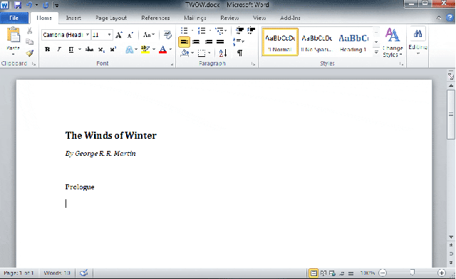
If you’re using Microsoft Word or other programs for word processing, email (e.g., Microsoft Outlook), or graphics programs (Photoshop), you’ll note that these programs have default fonts.
For example, Word automatically has the sans-serif font Calibri 11 point as its default. As you’re determining your business design and preferred fonts, you may wish to consider changing your default font in your different software programs.

Image Source: Giphy
Changing Default Font in Word
To change your font settings in word, follow these steps:
- Open a new Word document.
- You’ll then see the document window where users enter text, which is a blank section where users create content.
- You’ll see the Font group box to the above left, showing you a list of all installed fonts.
- You can select a different font and several customized, advanced options, such as font color, style (e.g., bold, italics, underline), point size, effects (e.g., all caps, small caps), and other options.
- When determining your default font, remember to consider its readability and legibility in addition to the tone it communicates.
- Once you’ve made your choice, right-click and click on the “Set as Default” button.
Changing Default Font in Outlook
You can also change your default font, style, size, and color in Outlook from Calibri to another font of your choice.
- Select “File.”
- Select “Options.”
- Click on “Mail.”
- Under “Compose Messages,” click on “Stationery and Fonts.”
- Then click on the “Personal Stationery” message tab
- Click on “New Mail” messages.
- Click the “Font” option.
- Click on “Replying or Forwarding Messages.”
- Go to “Font” to change your default font for messages you forward or to which you reply.
- Select the font type and style you wish to use.
You’re now ready to use your new font.
The Different Font Types
As noted above, there are different main categories of font types, some of which we’ve briefly touched upon above. The main font types and families include the following, all of which you can use as business fonts in certain mediums under specific circumstances:
Serif Fonts
Traditional and old-style fonts are also known as serif fonts since they have tiny “feet,” called serifs, at the tips of the glyphs. They contain thick stems and taper and thin at an angle, essentially forming small triangles.

Image Source: Freepik
These fonts provide a classical, literary feel and are the most readable fonts for printed body copy. Because they may tend to get lost and appear fuzzy on television and computer screens (particularly on low-resolution screens), old-style fonts on screens should be big and bold in the form of headlines.
Popular, classic serif typefaces include:
- Times New Roman
- Bookman Old Style
- Garamond
In addition, some serif fonts have been explicitly designed to appear more clearly, even on low-resolution screens, such as the Georgia font.
Sans-Serif Fonts
Sans serif (meaning “without serif” in French) refers to fonts that do not have serifs. Their strokes are uniform in thickness, and they can vary significantly in size and shape. Sans-serif fonts provide a clean, robust and clear look to any medium.
Businesses often choose sans-serif fonts to express simplicity and modernity. In print, sans serif works well in headlines and small bursts of text, such as sidebars. Sans-serif fonts have high readability with on-screen mediums, such as:
- Arial
- Helvetica
- Verdana
Bolding and using large point sizes make such fonts excellent headings and subheadings.
Note that different weights of the same sans-serif font can communicate considerably different voices and tones. That is, thick sans-serif fonts may shout strength and hard work. In contrast, thinner forms may convey nobility and sophistication.
Decorative Fonts

Image Source: Freepik
Decorative fonts may also vary widely, ranging from handwritten to vintage or historical type, Gothic type, or whimsical lettering.
Because these fonts tend to be ornate, limit your use of decorative fonts to headlines, small amounts of text, or decorative details for print and screen applications.
You’ll find that decorative fonts do not work well with an extensive copy. Instead, they can provide a beautiful, effective contrast on rectangular print pages and pair well with simpler fonts, such as old-style fonts.
Script Fonts
These fonts often appear like formal, old-fashioned handwriting and cursive writing, where the glyphs connect on the downstroke.

Image Source: Freepik
Many script fonts can be relatively difficult to read, so they are best limited to small amounts of text for print, web, and mobile applications. They also form striking drop caps and decorative elements in logos.
Modern Fonts
Modern fonts have long, thin horizontal serifs and clear transitions in their strokes based on geometric forms and lines.
Their stress is vertical, meaning that their letters do not slant. Modern fonts are highly structured and may seem cold to some readers since they tend to have a more relaxed vibe.
Although you can use modern fonts effectively in headlines and as decorative details for print materials, you should avoid using them as body copy due to poor readability. They also are not appropriate for on-screen applications.
Slab-Serif Fonts
Like serif fonts, slab-serif fonts are heavy and thick, appearing like a sans-serif font with “chunky” serifs. Because slab serifs work well as print headlines, some businesses frequently use them in retail display advertising.
Although you can use some slab-serif fonts as body copy, old-style fonts usually are best. In addition, although slab-serif fonts work on-screen, such as for web- and TV-based applications, as with decorative fonts, their use is somewhat limited.
History of Fonts
Typefaces and fonts are constantly evolving, with many businesses recognizing that changing them can play an essential role in updating their brands.
This evolution demonstrates how crucial it is to select the correct fonts to define your brand and give the impression you wish to convey to your current and future clients.
In fact, when Google decided to update its image by changing its logo and using a new typeface, there was a great deal of chatter among those in advertising and marketing worldwide.
Image Source: Giphy
As Google’s most significant redesign since 1999, the new logo and font introduced in 2015 removed the serif font and replaced it with a “simple, uncluttered, colorful, and friendly” font called Product Sans.
Google created this proprietary, sans-serif, contemporary, geometric font for updated branding purposes.
Microsoft is also getting into the action, changing its default Office font for the first time in almost 15 years.
Moving away from the Calibri sans-serif font in 2022, Microsoft invites everyone to help choose their new default font. Microsoft has commissioned five new custom sans-serif fonts in traditional and modern styles, including one font inspired by German railway and roadway signs.
Frequently Asked Questions
1. What are the main types of fonts?
The main types of fonts include serif, sans-serif, decorative, script, modern, and slab-serif fonts. Each type serves a unique purpose, from enhancing readability to conveying specific emotions in your business branding.
2. How do I choose the right font type for my business?
To select the right font, consider your brand’s personality, the medium (print or digital), and readability. For example, serif fonts are great for formal brands, while sans-serif fonts work well for modern, digital applications.
3. Can I use multiple font types together?
Yes, but limit yourself to two complementary font types. For example, use a serif font for headlines and a sans-serif font for body text to maintain a clean, professional look.
4. Why is font readability important for my business?
Readable fonts ensure your message is clear and engaging. Fonts with high readability can boost user experience, improve comprehension, and positively impact your brand’s credibility.
5. What are web-safe fonts, and why should I use them?
Web-safe fonts, like Arial, Times New Roman, and Verdana, are universally supported across devices and email clients. Using them ensures your content appears as intended for all users.
Conclusion
Fonts are constantly evolving and changing, as we can see from history. Learning to utilize fonts for your business and advertising is essential in a very technologically advanced society.
There’s always an opportunity to learn more about the fascinating ongoing evolution of typeface style. Ask yourself: what steps are you now going to take to select the perfect fonts for your business or update your business fonts and your overall business brand today?
You can signup for free and run your first test within minutes.
- Best RAG Software for Businesses in 2026: Top Platforms Compared - July 16, 2026
- 10 Best Zendesk AI Alternatives in 2026 - July 15, 2026
- Best AI Chatbot for 24/7 Customer Support in 2026 - July 14, 2026


