
“A logo is not just a name or a symbol. It’s an identity.” -Unknown
If you’re looking to improve your logo design skills, then you need to check out these five hacks! You’ll learn how to create unique designs that stand out from the rest, and you’ll be able to take your business to the next level.
From choosing the right colors to creating a unique design, these tips will help you create a logo that will stand out from the rest.
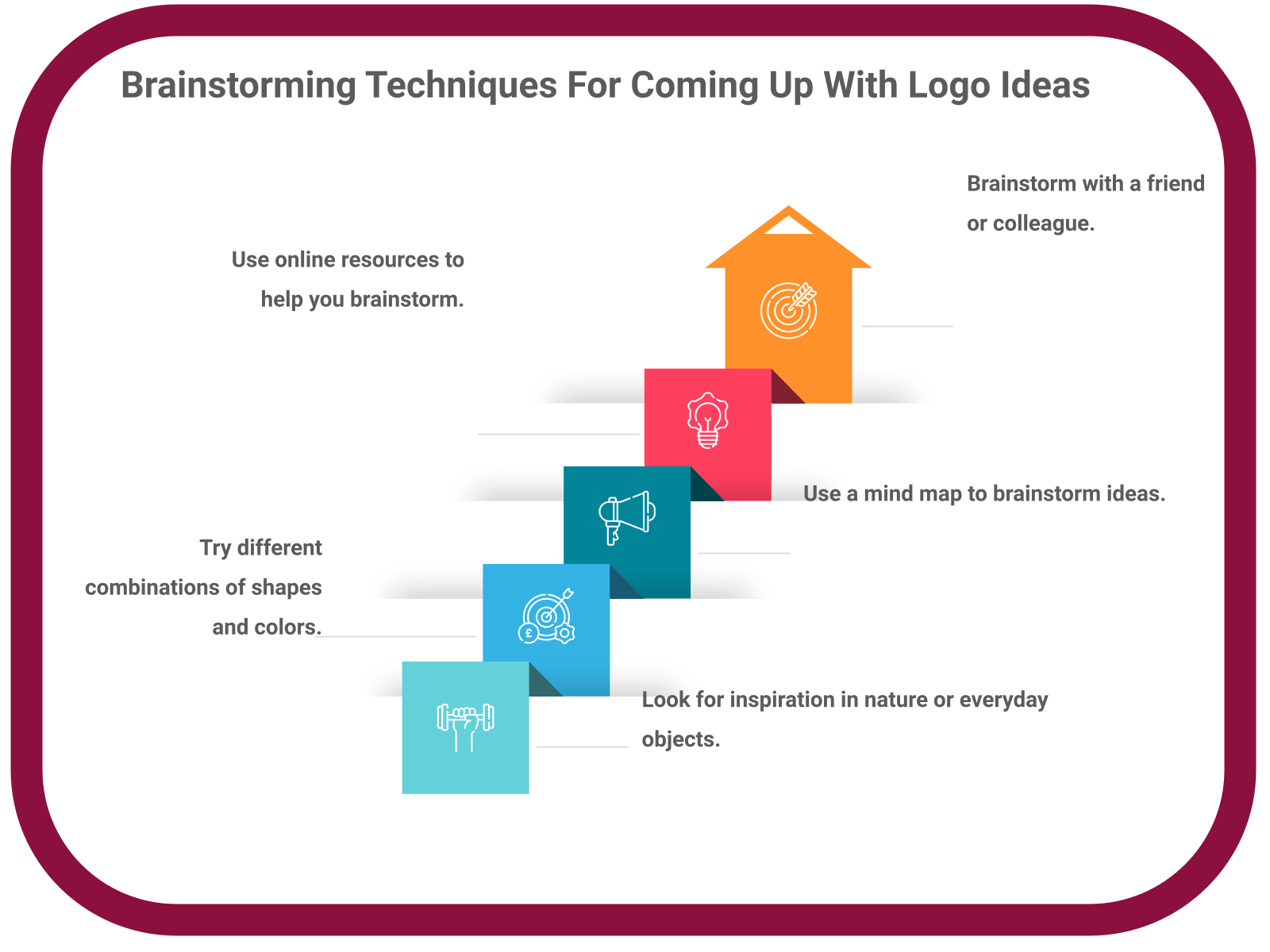
Brainstorming Techniques For Coming Up With Logo Ideas
1. Keep it simple: When it comes to logos, less is almost always more. A complex logo can be difficult to remember and reproduce, and may even turn off potential customers. So when brainstorming logo ideas, try to keep things as simple as possible.
2. Think about what your logo represents: What is the message you want to communicate with your logo? What kind of feeling do you want it to evoke? Answering these kinds of questions can help you narrow down your ideas and create a more effective logo.
3. Use strong visual elements: A great logo should be eye-catching and memorable. That means using strong visual elements like color, shape, and form to create a logo that will stand out.
4. Consider your audience: Who are you trying to reach with your logo? What kind of design will appeal to them? Keep your target audience in mind when brainstorming ideas to make sure your logo is effective.
5. Get creative: There are no rules when it comes to creating a logo, so don’t be afraid to experiment. Be creative, think outside the box, and let your imagination run wild. The best logos are often the ones that are the most unique.
Brainstorming techniques for coming up with logo ideas:
How To Use Color In Logo Design
How to use color in logo design
Color is one of the most important aspects of any logo design. It can communicate messages about your brand, convey emotions, and affect how your logo is perceived.
There are a few things to keep in mind when using color in your logo design:
1. Use colors that represent your brand.
2. Design with colors that convey the right emotions.
3. Make sure colors will look good on both light and dark backgrounds.
4. Use colors that will print well.
5. Consider people that are color bling when choosing your colors.
Keep these tips in mind and you’ll be able to create a logo that looks great and communicates the right message to your audience.

Tips For Creating Simple Yet Effective Logos
1. Use strong, clear typography
Your logo should be easy to read, even when it’s reproduced at a small size. When choosing a font for your logo, make sure it is legible and easy to read.
2. Avoid using too many colors
While you want your logo to be eye-catching, using too many colors can make it appear busy and cluttered. Stick to two or three colors maximum.
3.Make sure your logo can be reproduced in black and white
Your logo should look just as good in black and white as it does in color. This is important for printing and other applications where color is not an option.
4.Use negative space
Negative space is the area around and between the elements of your logo. Use it to your advantage by making sure your logo looks good even when it’s printed on a busy background.

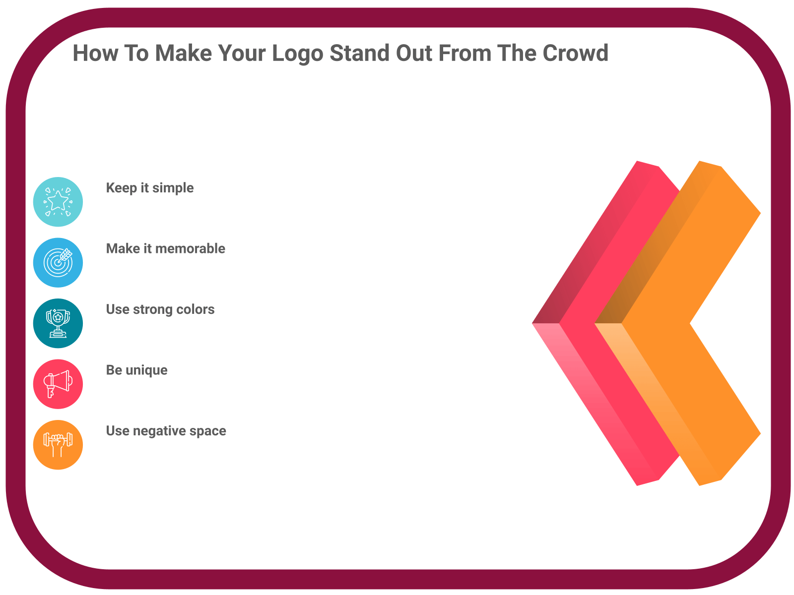
How To Make Your Logo Stand Out From The Crowd
Your logo is one of the most important aspects of your business. It’s how customers will remember you and it’s a big part of your branding. So it’s important to make sure your logo is unique and stands out from the crowd.
Here are five hacks to make your logo stand out:
1. Use a unique color palette:
2. Choose a unique font:
3. Use a unique shape:
4. Create a unique design:
5. Write a unique message:
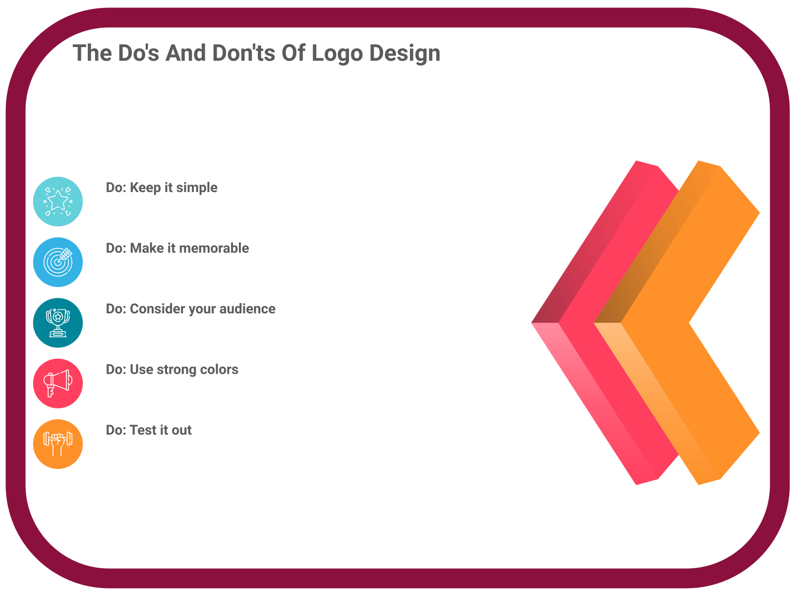
The Do’s And Don’ts Of Logo Design
There are some important things to keep in mind when designing a logo. Here are some dos and don’ts to help you create a successful logo.
Do:
1. Keep it simple – A logo should be easy to read and understand. Avoid using complex graphics or too many colors.
2. Make it memorable – A logo should be unique and recognizable. It should be able to stand out from other logos in its industry.
3. Use negative space – Negative space is the empty space around the subject of an image. It can be used to create interesting and eye-catching designs.
4. Use vector graphics – Vector graphics are images that are made up of mathematical equations. They can be scaled to any size without losing quality.
5. Test it out – Before finalizing a logo, it’s important to test it out in various situations. This includes print, digital, and in different colors.
Don’t:
1. Don’t use clip art – Clip art is pre-made images that can be easily inserted into designs. They often look cheap and unprofessional.
2. Don’t use too many fonts – Stick to one or two fonts in your logo. Using too many fonts can make a logo look cluttered and busy.
3. Don’t use generic icons – Generic icons are icons that are used in many different logos. They can make a logo look unoriginal and unimaginative.
4. Don’t use stock photos – Stock photos are photos that can be purchased and used in designs. They should be avoided in logos as they can look like anyone else’s logo.
5. Don’t make it too complicated – A logo should be easy to understand. Avoid using too many graphics or colors.
Quick Tips
- Start with a sketch: Get your ideas down on paper first. This will help you narrow down your options and decide on a direction for your logo design.
- Keep it simple: A logo should be easy to understand and remember. Avoid using too many colors or complicated graphics.
- Use typography: A great logo design often relies on strong typography. Use different fonts and experiment with different arrangements to create a unique and eye-catching logo.
- Consider negative space: The empty space around your logo can be just as important as the logo itself. Use it to create balance and interest in your design.
- Think about your audience: Who will be seeing your logo? Make sure it appeals to your target audience and conveys the right message.
Conclusion
There’s no one-size-fits-all answer to logo design, but these five hacks should give you a good starting point. Keep these in mind as you work on your own logo designs, and you’ll be sure to create something that’s both unique and memorable.
Looking for a new logo? Poll the People is the perfect place to get feedback on your designs. And it’s free to sign up! Just head over to our website and create an account. Then upload your logo design and start polling.
You’ll get valuable feedback from our community of logo designers, and you might just find your new favorite design. So what are you waiting for? Sign up today!
- How To Retain SEO Ranking After A Redesign - February 22, 2023
- Ultimate Guide: How to Write Brand Names - February 17, 2023
- 10 Best Practices for Using Video in Your Email Marketing Campaigns - February 8, 2023


hand craft logo
To have a successful and long term relationship with the targeted audience, it is necessary to understand the benefits good and well-designed logos could bring to your work.
Dibujos Para Colorear WK
I stumbled upon your article on logo design hacks, and I must say, it’s packed with some valuable insights! As someone who’s always looking to enhance my logo design skills, I found your tips and tricks to be incredibly helpful.
The brainstorming techniques you mentioned really resonated with me. Keeping the logo simple and memorable is key, and understanding the message and emotions it should convey is crucial. It’s fascinating how color plays a vital role in logo design, and your advice on using colors that represent the brand and work well on different backgrounds is spot-on. Taking into account color blindness is an excellent consideration that often gets overlooked.
The tips you shared for creating simple yet effective logos are fantastic. Typography is indeed a powerful tool, and selecting the right font can make all the difference. I appreciate your emphasis on minimalism and the ability to reproduce the logo in black and white, ensuring its versatility across various applications.
Lastly, your hacks on making a logo stand out from the crowd are golden. A unique color palette, font, shape, design, and message can truly set a logo apart. These hacks serve as a reminder that originality and creativity go hand in hand when crafting a remarkable logo.
Thank you for sharing your expertise, Owen! I’m definitely going to apply these hacks to my future logo designs and see how they elevate my work. Keep up the great content!
GridsGlobal
Thank you for your efforts on the logo design concept! The concept is looking great and aligns well with our brand identity.